Thursday, 15 September 2011
V&A SHADOW CATCHERS CAMERALESS PHOTOGPRAHY
SHADOW CATCHERS
Invocation by Adam Fuss
Adam Fuss was born in London and now lives and works in New York. He was first drawn to photography at school in England, sensing that it might satisfy his passion for science and his growing interest in art. Most of his images, including Invocation, result from experimentation with some of the earliest of all photographic techniques, such as the photogram.
A photogram is a photograph made without a camera by placing objects in direct contact with light-sensitive paper. Upon exposure to light, the paper records the contours of the objects and their textures. Victorian photographers such as W. H. Fox Talbot used this technique to produce delicate impressions of leaves, lace and flowers. These were admired for their detail and clarity.
This image is a photogram of a baby resting in a shallow tray of water. In the split second that the flash was fired, it exposed the photographic paper in the bottom of the tray. This captured the outline of the baby's body and its movements, which are seen as a halo of ripples in the water. The resulting image has a sculptural quality, for it is darkest where the baby was actually touching the paper, allowing very little or no light to reach the paper. For Fuss, light acts as an important metaphor for spiritual growth and understanding. It is something he regards as 'endless, huge and unspecific'.
The dye destruction print, also known as Cibachrome or llfochrome, comprises three layers of emulsion; each sensitised to one of the three primary colours. The technique produces a high gloss surface and a vibrant range of colours which are resistant to fading. Through his use of modern photographic papers and 'live' objects, Fuss has re modelled one of the oldest and simplest photographic techniques to create arresting images which are at once abstract and familiar.
In Fuss's photograph, the baby appears suspended in the centre of a yellow ground. Its head tilts up and its arms are held out, each in a 'V' shape, balancing its body. It is resting with its legs apart and bent at the knee. The baby's reflection in the water creates four broken rings behind and below its right leg, and six broken rings below its right elbow.'The photograph was described to me very vividly and I could imagine the baby. I looked at a tactile drawing and the baby was in something like a cup. It was explained to me that this was like a baby in the womb and the whole thing came alive to me. It would be impossible for me to access this photograph through touch. If you were to touch a baby in water it would curl up or splash out and change shape completely.'
http://www.vam.ac.uk/channel/people/photography/shadow_catchers_camera-less_photography_adam_fuss/
Another great artist that was featured was Floris Neususs.
Untitled (1962) by Floris Neusüss
Floris Neusüss's use of nude models, for his full-length female portraits makes for some rather intimate viewing, for example. Seemingly caught in mid-air or coiled against the surface of his canvas, the images produce more than just the conventional silhouette, catching each contour and minute hair of his subjects. The effect is oddly voyeuristic and unsettling.
Wednesday, 14 September 2011
GALLERY OF MODERN ART BRISBANE
http://qag.qld.gov.au/
GALLERY OF MODERN ART BRISBANE- SURREALISM
GALLERY OF MODERN ART BRISBANE- SURREALISM
The exhibition presents a historical overview of Surrealism, charting its evolution from Dada experiments in painting, photography and film, through the metaphysical questioning and exploration of the subconscious in the paintings of Giorgio De Chirico and Max Ernst; to the readymade objects of Marcel Duchamp and Man Ray’s photographs.
Gaining traction in the early 1920s, the movement's development is explored through the writings of Surrealism’s founder André Breton and key early works by André Masson. Also included is a remarkable selection of paintings and sculptures by surrealists Salvador Dali, Rene Magritte, Victor Brauner, Joan Miró, Alberto Giacometti, Max Ernst and Paul Delvaux.
Film and photography are also represented throughout the exhibition, including films by Luis Buñuel and Salvador Dalí, René Clair and Man Ray. Important photographic works by Hans Bellmer, Brassaï, Claude Cahun, Dora Maar, Eli Lotar and Jacques-André Boiffard also feature. The exhibition is rounded out with late works that show the breadth of Surrealism’s influence, and includes major works by Jackson Pollock, Arshile Gorky and Joseph Cornell.
The surrealist group was formed in the spirit of revolt that characterised the European avant-garde of the 1920s. Just like the Dada movement, in which some of them had participated, these poets and artists denounced the rationalist arrogance of the late nineteenth century, which had been halted in its tracks by the First World War. However, perceiving Dadaism’s incapacity to build new positive values, the surrealists broke away from it to proclaim the official existence of their own movement in 1924.
Dominated by André Breton, Surrealism was, at first, essentially a literary movement. Its field of inquiry was experimentation with language, free from conscious control. This way of thinking was soon extended to the plastic arts, photography and cinema — not only by virtue of Breton's inclinations, though he himself was a collector and art lover, but also by the involvement of artists from all over Europe and the United States who had moved to Paris, which was widely considered the world’s arts capital at the time.
The surrealist artists introduced the theory of the liberation of desire through the invention of techniques that aimed to reproduce the mechanisms of dreams. Taking their inspiration from the work of Giorgio de Chirico, who was unanimously acknowledged as the founder of the surrealist aesthetic, they strove to reduce the role of consciousness and the intervention of the will.
The techniques of frottage and collage used by Max Ernst, the automatic drawings made by André Masson and Man Ray's rayographs are the first examples of this. Shortly after, Joan Miró, René Magritte and Salvador Dalí produced dreamlike images by bringing about a juxtaposition of disparate elements.
Their first group exhibition was held in Paris in 1925. The movement subsequently spread abroad, achieving international renown with the 1936 exhibitions in London and New York, then in Tokyo in 1937 and in Paris in 1938. This fame was enhanced by most of the group’s wartime departure for the United States. Thus, Surrealism profoundly inspired North American art: for example, the practice of automatism is one basis for Jackson Pollock's work and for ‘action painting’, while the surrealists’ interest in objects prefigures Pop art.
Surrealism developed over more than 40 years, from the historic avant-gardes of the early twentieth century to the emergence of new currents in the 1960s. Besides North American painting and Pop art, surrealist art lay behind the appearance of a second avant-garde wave in Europe in the 1960s, its foremost representative being New Realism.
This was the best exhibition i visited whilst away, it was quite overwhelming though as there is so much information to take in and understand when it comes to surrealism.
SALLY MANN PHOTOGRAPHY
A friend of mine first introduced me to the work of Sally Mann a few years ago. Showing me a book of her work Immediate Family, I was struck by Mann’s work as it is very unique, her work covers a lot of themes within each photograph. They stood out to me because I think they are very beautiful images but at the same time there is an essence of her sexualizing her children, which makes it uncomfortable to look at in some respects, making the viewer question whether to like them or not.
To me I think it is very creative, how she creates the viewer to think about what they are looking at and think about their response. They are stunning images, but could be seen to hold controversy. Although the children are naked in some of the images, they portray qualities of dignity, individuality and intimacy. You can see the relationship with her children is strong.
Mann’s work has elements of film noir with the soft black and white contrast, and the clothes and props the children have, such as pearls, white dresses and cigarettes. Mann has created images that show children acting as adults with them smoking and pushing prams, which i think is very effective.
The series focuses on her three children, all aged under ten. The photographs brought up a lot of controversy due to the children being naked in some shots. She became famous for her “controversial” photographs, critics accused her of creating pornography, being a bad mother, abusing her children and providing an incitement to pedophiles. While the series does show themes like cultural perceptions of sexuality, they also depict the ordinary moments in their daily lives, playing, swimming and dressing up. I think her work is very effective and elegant.
GALLERIES
Before i went traveling at the start of the year i went to the Nation Portrait Gallery to look at the Taylor Wessing, Photographic Portrait Prize 2010.
THE EXHIBITION
The Taylor Wessinf Photographic Portrait Prize 2010 presents the very best in contemporary portrait photography, showcasing the work of talented young photographers and gifted amateurs alongside that of established professionals and photography students.The Taylor Wessing Photographic Portrait Prize 2010 presents the vesry best in
spontaneous and intimate moments capturing friends and family.Through editorial, advertising and fine art images, the entrants have explored a range of themes, styles and approaches to the contemporary photographic portrait, from formal commissioned portraits to more spontaneous and intimate moments capturing friends and family.
What makes a good portraitPortraits grapple with what it means to be an individual. Each images is a one-off version of a highly personal negotiation between identity and representation. 'Beauty' and 'good' are elastic concepts. You or i will see not only with our eyes, but with all that we are and all that our culture is. These portraits deserve our attention because they applaud our infinite variety.
third prize- jeffrey stockbridge
TIC TAC AND TOOTSIE
(TWIN SISTERS CARROLL AND SHELLY MCKEAN)
FROM THE SERIES NOWHERE BUT HERE
The streets of Philadelphia have provided the primary source of inspiration for American photographer Jeffery Stockbridge. The bulk of his work has catalogued drug addiction, prostitution and urban decay. His portrait comes from a series-in-progress Nowhere But Here and depicts twin sisters, who at nineteen were kicked out of their home by their brother and had been living on the streets for a year when stockbridge met them, while scouting subjects in the socially deprived Kensington district. Both had turned to prostitution and were using prescription drugs to help dull the pain of their difficult lives. The 4x5 negative allows him to make large-format colour prints, which he believes in necessary to convey the breath and intensity of his subject matter.
This image was my favourite from the winners, i was drawn to both of their expressions and also the simplicity of the image, how there is nothing to really distract you away from what the photographer wants you to focus on.
FELIX CARPIO
WAFA
FROM THE SERIES SYRIA
KURT HIERBST
TAGAR, 30, WITH THIS THREE DAUGHTERS: ASA, DITI, PRYA
FROM THE SERIES BIDESHI PHOTOSTUDIO
FROM THE SERIES STUDY SKIN
MARCIA MICAEL
THESE ARE SOME MORE OF MY FAVOURITE IMAGES TAKE FROM THE SHOW.
ARMIN HOFMANN (TYPOGRAPHY)
Armin Hofmann
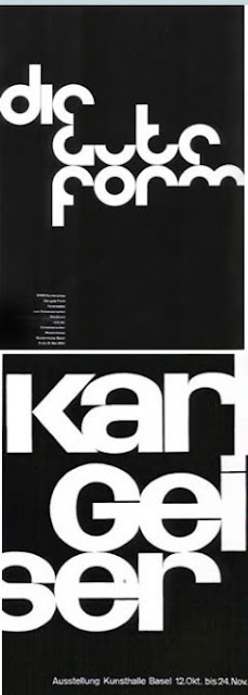
Swiss designer Armin Hofmann was one of the founders of the 'Swiss Style' - a more simplistic and clean-cut poster design, which still resonates in todays design world and is viewed as 'modern'. In this work we can focus on the shape created by the use of negative space, which gives the poster high impact - and thus makes the viewer more interested, who will then register the rest of the information.
Hofmann believed in little use of colour because of what he believed was the 'trivialization of colour' in the art world at the time. That belief is what makes some of his pieces so strikingly beautiful. This poster gives emphasis to the hands, ghost-like, and when paired with abrasive red script, the poster gets a little bit of haunting quality to it.
The founding of his 'swiss style' in typography included cleanliness and readability, as well as a preference of photographic images over illustrations; this poster epitomizes this and this is why his work translates so well into the modern world, where anyone with a computer can now photoshop their own photographs with text.
Some of his posters reminded me of the exercises we did in class at Camberwell with typography - although he doesn't push the envelope too far because of his beliefs on legibility, he gave new inspiration to the way typography could be used, considering most of his work dates back to the 50s and 60s.
I also found these pieces of work, though I can't be sure what media they were meant for - his use of simple shapes, layout and high contrast with black and white are really interesting, and his work does seem really forward thinking, because in my opinion, this looks like it could be used nowadays, or could very easily be translated into film.
HOUSE OF CARDS HAS WINNING HAND
The House of Cards campaign for Shelter created by Leo Burnett and our own Domenic Lippa has reaped several awards this year.
Lippa was approached by Leo Burnett’s Richard Brim and Daniel Fisher and asked to create the identity for the campaign and auction event last September as well as an exhibition catalogue and a limited-edition box of A5 playing cards.
Awards for our portion of the project include: two Golds in the 2010 Andy’s, In book for Integrated in the Creative Review Annual, four Merits in this year’s One Show, a Gold from the New York Festivals, and a Gold Design Lion at the Cannes International Advertising Festival.
NEW WORK: THE PLAING PLACE
A shipping container has been placed in the middle of Truro, Cornwall and named The Playing Place. It opened on 26 March and will remain in place until 25 April. Inside the container visitors are able to interact with written and spoken language, stories and theatre. Domenic Lippa was invited to design a poster for the interior of the container influenced by the words of the BBC and Channel 4 script writer, James Henry.
Inspired by one sentence in the text Domenic Lippa and his team created a red and black comma referencing the fox’s tail. Here is the complete text written by James Henry describing his memorable introduction to theatre:
‘A True Story.’
‘The first play I ever saw was at the Minack Theatre, an adaptation of The Lion, the Witch and the Wardrobe. I was eleven, and fell in love with the girl playing a fox. She had a wonderful bushy red tail, and had devised a way of twitching it to punctuate her lines. I couldn’t work out how.
‘During the White Witch’s most dramatic exit, her sleigh toppled over accidentally. The audience gasped, but the White Witch retrieved the situation by enthusiastically whipping the dwarf driver until he righted the vehicle and dragged it off the stage by himself. The audience murmured in approval, and I realised at that moment there was almost no hole you couldn’t dig yourself out of, as long as you were prepared to publicly and physically rebuke the nearest sufferer of achondroplasia.
‘I know now that this was wrong, but after a lifetime of monstrous dwarf abuse, combined with a series of doomed relationships with red-haired women, I fear it is too late to change, and so I write from my prison cell in order to urge all parents to consider very carefully the first theatrical entertainment to which they subject their innocent, and perhaps too-easily-influenced offspring.
‘Sometimes I think the tail was real.’
Project Team: Domenic Lippa, partner, Jeremy Kunze and Lucy Groom designers, James Henry, writer.
THE FUTURE. IN 10 YEARS TIME I WILL BE....
In 10 years time i would love to be working with my uncle Dom at Pentagram studios in London. He been such a great inspiration to me and a great influence, constantly offering me advice and helping me in anyway possible.
Project
London Design Festival 2011
Client
London Design Festival
Identity for the 2011 London Design Festival.
Project Team: Domenic Lippa, partner-in-charge and designer, Jeremy Kunze and Lucy Groom, designers.
For the fifth year running Domenic Lippa and his team have worked to create the visual identity for the London Design Festival which runs from 17 to 25 September and is billed to be the largest and most significant yet.
This year’s design was launched at a press conference last month and takes as its inspiration the phrase ‘Design from all angles’ echoing the desire of the organisers to expand the list of events and disciplines taking part. Festival Director, Ben Evans, said “This year’s Festival will demonstrate the power and versatility of design across London; offering a series of quality projects that fulfill London’s design credentials.”
The team created the look by printing text on pieces of paper and then folding and photographing them from different angles. The differing angles enable the 2011 festival to have a flexible identity across the whole gamut of events whilst maintaining a consistent look and feel. Once more the identity leverages its ownership of red in order to create maximum impact.
PLACES/SITUATIONS I HAVE HAD IDEAS IN
FIJI
CAMBODIA
I recently went travelling for 5 months with my best friend Ria :)
Our first stop was Thailand, followed by, Cambodia, Vietnam, Loas, Malaysia, Singapore, Australia, New Zealand, Fiji and last but not least Hong Kong. (Just a few places)
I’ve never felt more inspired and had more ideas then in those 5 months away …..well how could you not visiting these amazing places filled with culture, vibrant colours, stunning views, and friendly people.
I had the most amazing 5 months of my life, and will remember the experience forever. Loving photography this was a great opportunity to take picture after picture of my surroundings, capturing everything. And that's what everyone kept telling me "Take loads of pictures" "Photograph everything" and to be honest i did.
I feel like you can never really tell how much travelling changes you until you come home, i felt different in myself and had a different perspective on life, plus people were telling me that i had changed, changed in a positive way though! My confidence grew, and i came back feeling happy within myself :)
I feel more independent and had this craving to visit more amazing places around the world and explore more cultures.
THINGS I WONT MISS ABOUT HOME
But to be honest......


I will miss those things as i recently got back from travelling for 5 months not to long ago, and towards the end i did miss a lot of things about being at home and now i have to get ready and pack to leave again, after i've just found myself settled back into home life. But one thing i really wont miss is having to tell my parents about 5 times a day what my plans are and telling them if i'm coming home or not! Wont miss that AT ALL!!
10 KEY FACTS ABOUT ME?!
1. Absolutely love Family Guy :)
2. I'm half Jamaican....and very proud of it!
3. I've never had ChickenPox!
6. I like Cocoa pops and custard..... strange i know!
7. I have a half brother called Junior Walker, there's an 11 year age difference between us.
8.My uncle is a Graphic Designer called Domanic Lippa, who works at Pentagram.
9. I've lived in the same hose for 20 years.
10. I love watching old musicals.
2. I'm half Jamaican....and very proud of it!
4. I'm completely terrified of snakes aaaaahhhhhhh (but love watching programmes about them, David Attenborough you legend, something so calming about his voice )
5. I have an addiction to buying perfume (over 60)
6. I like Cocoa pops and custard..... strange i know!
7. I have a half brother called Junior Walker, there's an 11 year age difference between us.
10. I love watching old musicals.
Subscribe to:
Posts (Atom)


